← Portfolio / Case Study
UI / UX Design Mobile App Figma College Project 2024

TogetherBites —
Food Sharing App

A community-focused food sharing app UI/UX design project — connecting donors, recipients, and delivery volunteers to reduce food waste and build stronger communities.

My Role
UI/UX Designer
Timeline
3 Weeks · 2024
Tools
Figma
Type
✦ College Project
Scroll to explore
TogetherBites App

What is TogetherBites?

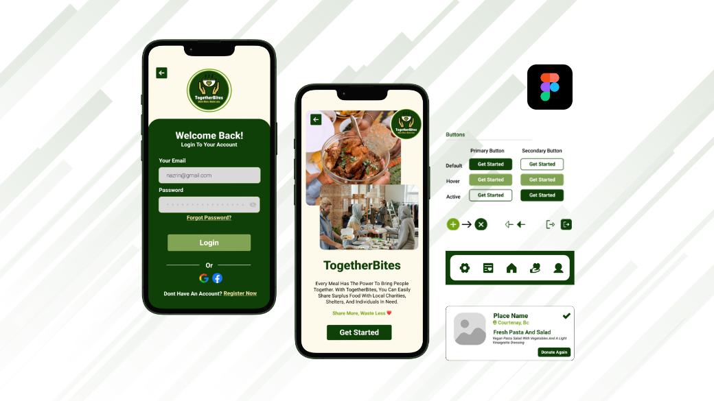
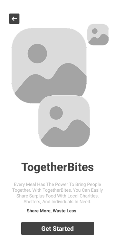
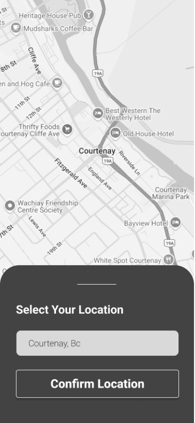
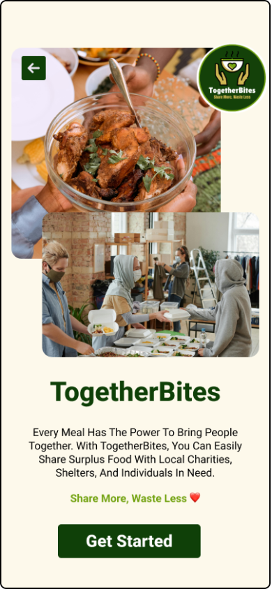
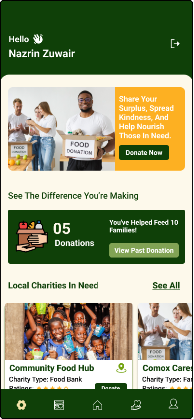
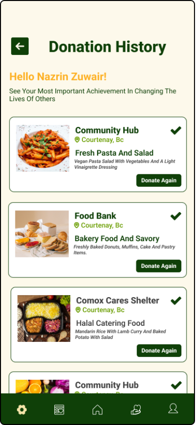
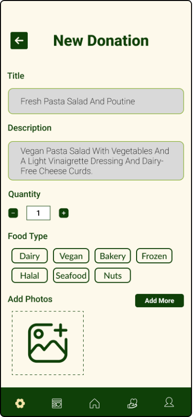
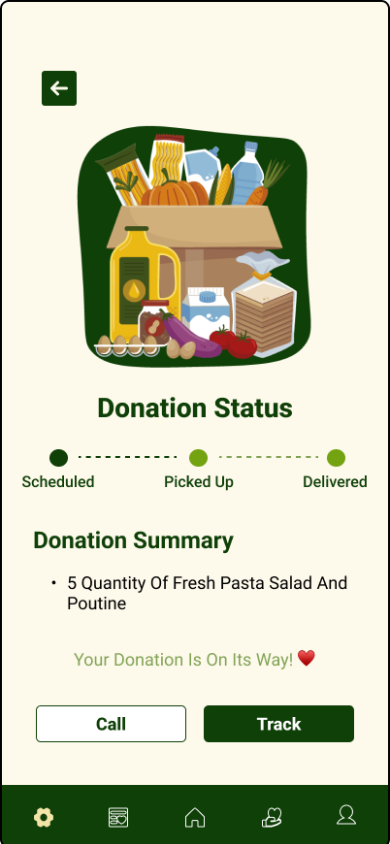
TogetherBites is a community-focused food sharing app designed to connect users who want to donate food, receive donations, and manage deliveries and pickups efficiently. The app bridges the gap between people with surplus food and those in need, making the process of giving and receiving as simple and dignified as possible.

This was a college UI/UX design project completed at North Island College as part of my Digital Design & Development programme. The brief asked students to design a mobile app concept that addressed a real-world social challenge. I chose food waste and food insecurity — two problems deeply connected, yet rarely addressed through a single, accessible platform.

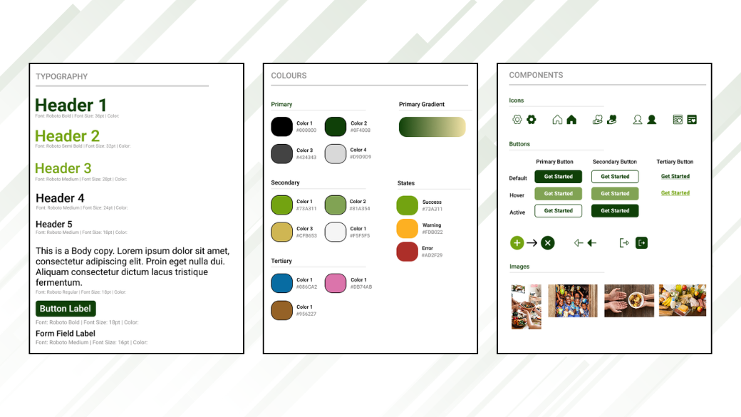
The project showcases the complete end-to-end UI/UX design process: from mood boards and wireframes to a full design system, high-fidelity mockups, and an interactive Figma prototype — all completed within a 3-week sprint.

Quick Facts
Context
College Project · North Island College BC
Industry
Food Tech · Social Impact
Deliverables
Design System · Wireframes · 20 Hi-Fi Screens · Interactive Prototype

Problem & Solution.

⚠️
The Problem
Millions of tonnes of edible food are wasted every year while many individuals and families face food insecurity. Existing donation systems rely heavily on formal organisations, creating barriers for smaller-scale everyday sharing. There was no simple, community-level mobile tool connecting food donors directly with recipients and volunteers.
The Solution
TogetherBites is a mobile platform where anyone can donate surplus food, browse available donations, and coordinate pickups or deliveries — all within a single app. The design prioritises simplicity, trust, and accessibility so that reducing food waste feels effortless and rewarding for every user.

Understanding the problem space.

Before opening Figma, I spent time understanding the landscape of food sharing, food waste apps, and community platforms. I reviewed existing apps like OLIO, Too Good To Go, and local food bank portals — identifying what worked, what was frustrating, and what gaps remained for everyday donors and recipients.

Key questions guiding the research: How do people currently donate food informally? What stops them from doing it more? What makes recipients feel safe and respected? What does a pickup or delivery flow actually look like in practice?

🔍 4 Competitor Apps Analysed
OLIO, Too Good To Go, local food bank portals
🗺️ 3 Key User Roles Defined
Donor · Recipient · Delivery Volunteer
📱 20 Screens Designed
From splash to delivery confirmation
Key Insights
01Friction kills good intentions — Existing apps were either too complex to list a donation or too dependent on organisations, discouraging casual users from participating.
02Trust is the core currency — Recipients need to feel safe claiming donations; donors need to know their food will reach the right person. Verification and transparency are essential.
03Location is everything — Food sharing is hyper-local. The most important feature is seeing what is available nearby, right now.

Building a consistent foundation.

Before designing a single screen, I created a full design system in Figma to ensure every screen felt cohesive and purposeful. A well-built design system speeds up the process and prevents inconsistency as the number of screens grows.

Typography — Roboto

I chose Roboto for its clean, modern, and highly readable characteristics — well suited for a utility app where clarity matters. The type scale uses:

Bold Headlines & primary actions
SemiBold Subheadings & card titles
Medium / Regular Body text, labels, descriptions
Colour Palette

Warm tones, greens, and neutral grays combine to convey community, sustainability, and clarity — reinforcing the app's purpose without feeling clinical or corporate.

Primary Green
Light Green
Warm Orange
Warm Cream
Dark Gray
Off White
Reusable Components

I designed a library of consistent, reusable components — navigation bars, donation cards, action buttons, input forms, status badges, and icons — so every screen feels part of the same system and future screens can be built quickly.

Component library
Design system system

Mapping the key journeys.

Before wireframing, I mapped out the core user flows for each of the three roles — donor, recipient, and volunteer. Understanding these journeys helped me ensure the navigation structure was logical and that no critical step was buried or missing.

Core User Flows Designed
Onboarding Splash → Start screens → Location selection → Sign up / Login
Donate Dashboard → Donate food form → Submission confirmation → Donation history
Receive Dashboard → Browse nearby donations → Claim → Track pickup
Deliver Dashboard → Accept delivery task → Delivery confirm screen

Structure before style.

I created low-fidelity wireframes to plan the app's layout and user flows before committing to any visual design decisions. Working in grayscale and simple shapes allowed me to focus entirely on navigation, hierarchy, and interaction patterns — making it easier to spot and fix problems early.

Wireframing covered all key screens: onboarding, signup/login, location selection, the dashboard, donate and receive flows, donation history, and the delivery/pickup confirmation screens. Each wireframe went through at least one round of critique and revision before moving to high fidelity.

Start Screen 1
Start Screen 2
Splash Screen
Confirm Location
Sign Up
Login
Donation Submitted
Delivery Confirm
Low-fidelity wireframes covering all key user flows — exported from Figma

Bringing it to life.

With wireframes validated, I moved into high-fidelity design — applying the design system, typography, colour palette, and reusable components to every screen. I designed 20 high-fidelity mockups in total, focusing on making every interaction feel intuitive and every screen visually polished.

Particular attention was given to micro-interactions: button states, confirmation screens that celebrate the user's contribution, and status indicators for the pickup and delivery flow that give users real confidence their food is on its way.

Splash Screen
Login
Dashboard
Donation History
Donate Food
Donation Confirmed
Delivery Confirm
Track Pickup
8 of 20 high-fidelity mockups — full set available in the Figma file

What the app does.

🍽️
Donate Food
A simple form lets anyone list surplus food with a photo, description, quantity, and pickup window — so donating takes under two minutes.
📍
Location-Based Discovery
Recipients browse available donations nearby, filtered by distance — making hyper-local food sharing fast and practical.
📋
Donation History
Donors can track their past contributions; recipients see claimed items and delivery status — full transparency for everyone involved.
🚗
Delivery & Pickup Flow
A dedicated volunteer role allows community members to collect donations on behalf of recipients — with a simple task acceptance and delivery confirmation screen.
📡
Track Pickup
Recipients can follow the status of their claimed donation in real time — knowing exactly when and where to collect, removing uncertainty from the process.
🔐
Secure Signup & Onboarding
A clear, trust-building onboarding flow including location confirmation and account creation ensures users feel safe from their very first interaction.

Try the prototype.

The interactive Figma prototype covers the complete user journey — from splash screen through onboarding, food donation, and pickup tracking. Click through the screens below or open the full prototype in Figma.

Interactive prototype — click through the full user flow

Designed entirely in Figma.

This was a pure UI/UX design project — no development or coding was involved. Figma was used for every stage: mood boarding, wireframing, building the design system, creating high-fidelity mockups, and assembling the interactive prototype.

🎨
Figma
🖋️
Roboto Font
📐
Auto Layout
🔧
Components
Prototyping
📏
Design System

What was delivered.

20 High-fidelity screens designed Full app from splash to delivery
3wks Completed within sprint Research through prototype
1 Full design system built Type, colour, components, icons

What I learned.

01
Build the design system first. Starting with typography, colours, and components before touching a single screen made the entire process faster and more consistent. Every screen benefit from decisions made upfront rather than retrofitted later.
02
Wireframes save time, not waste it. Spending extra time in low-fidelity caught several navigation and flow problems early — before any visual design had been invested. The high-fidelity phase was significantly smoother as a result.
03
Design for emotion, not just function. Screens like the donation confirmation and pickup tracker are functionally simple — but they needed to feel good. A warm colour, a friendly illustration, or a clear progress indicator can turn a transactional moment into something that motivates users to come back.
Next Project →
NR Property Management — Web Design
View Case Study →
← Back to Portfolio
Share: in