A cross-platform maintenance request management app built for tenants and property managers — replacing slow email chains and paper forms with a real-time digital workflow.
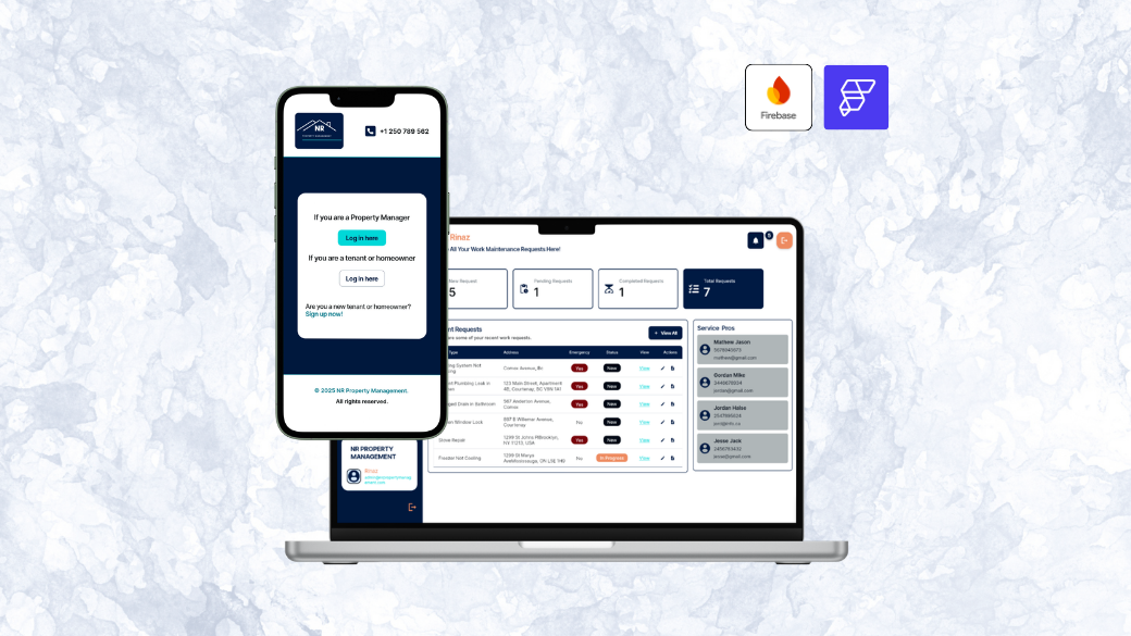
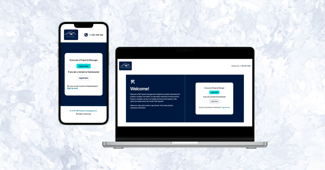
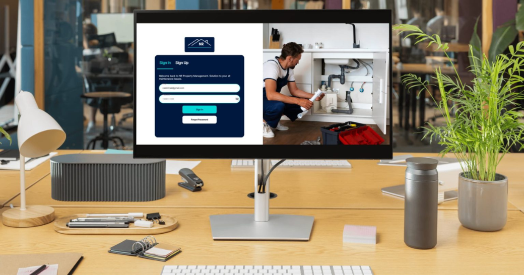
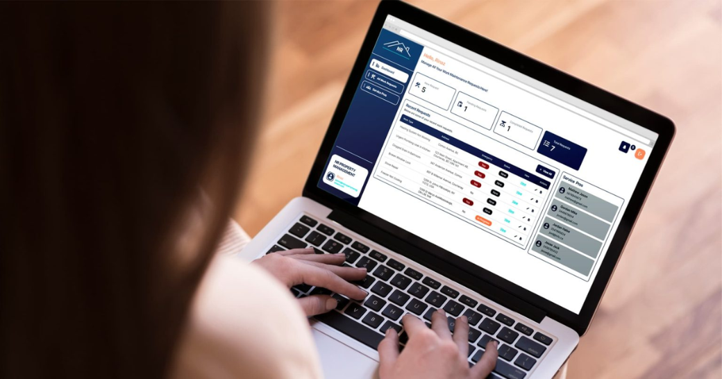
NR Property Management is a web and mobile application designed to optimise the process of managing and tracking maintenance requests. The app allows tenants to easily submit maintenance requests and upload photos, while administrators can accept, update, and manage each request in real time. Both parties receive instant notifications and can monitor progress throughout the process, ensuring greater transparency and communication.
This project was my capstone for the Post-Graduate Diploma in Digital Design & Development at North Island College (NIC), 2025. The brief was to design and build a complete, production-ready digital product from concept through to deployment — covering branding, UX/UI design, full-stack development, and brand collateral.
Traditional maintenance management still relies on email threads, phone calls, and paper forms — systems that are slow, error-prone, and nearly impossible to track at scale. NR Property Management replaces all of that with a clean, real-time digital workflow that benefits both tenants and property managers.
The first step was identifying who would actually use this app. Two distinct groups emerged with fundamentally different needs — and both needed to be served well for the product to work.
Once the two audiences were clear, I defined their specific functional requirements before designing a single screen. This ensured every design decision was grounded in a real need rather than assumption.
Before touching Figma screens, I created a moodboard to establish the visual direction for NR Property Management. The goal was a design that conveyed reliability, professionalism, and ease of use — qualities a tenant or property manager needs to feel when trusting an app with something as important as their home.
The colour scheme focused on calming blues and grays — colours that communicate trust, authority, and clarity without being cold or corporate. Typography was chosen for its readability and modern feel, ensuring neither tenants nor admins would struggle to navigate. Icons and interface elements were kept simple and purposeful, guiding users without overwhelming them.
The stack was chosen deliberately to balance development speed, cross-platform reach, and real-time capability — three things this type of app demands.
The final UI balances clean professionalism for the admin side with a welcoming, easy-to-navigate experience for tenants. Blue and gray tones keep things trustworthy and clear, while generous spacing and simple iconography reduce cognitive load for users who may be stressed about a maintenance issue.
As part of the capstone deliverables, I designed physical brand collateral to bring NR Property Management into the real world. Extending a digital brand into print and product design reinforces identity consistency and demonstrates how a brand lives beyond the app itself.
Deliverables included a crew t-shirt, a custom packaging box, a branded tote bag, and a branded water bottle — all using the app's blue-and-gray palette and clean typographic system.
NR Property Management was completed as a fully deployable product — live and accessible to real users — along with a complete visual identity and physical brand collateral.